
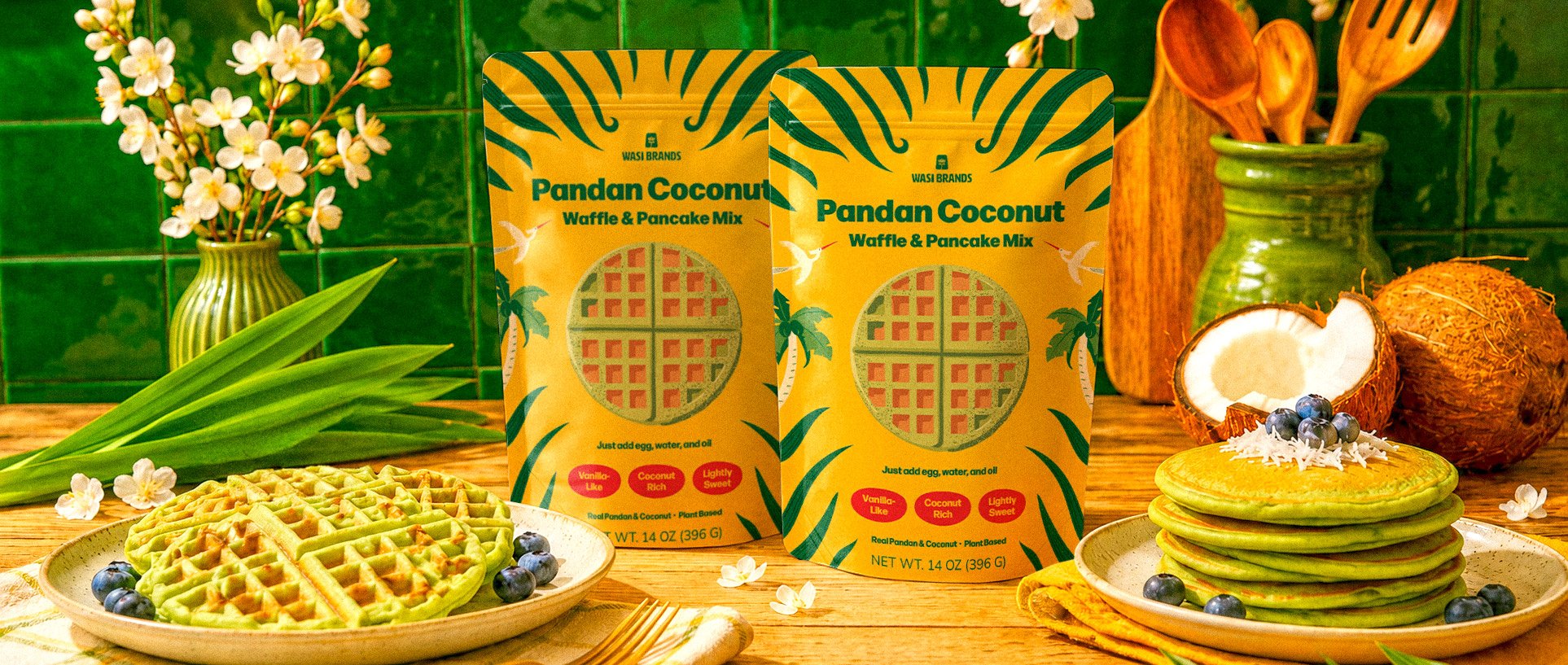
Wasi Brands
Overview:
Wasi Brands is inspired by the Vietnamese and Peruvian foods its founder grew up eating, making heritage flavors more accessible through familiar pantry staples.
Challenge:
Pandan is unfamiliar to many Western shoppers, making it difficult to earn a first purchase without sacrificing its cultural authenticity. The identity needed to appeal to those who grew up with these flavors while remaining approachable and inviting to those discovering them for the first time. It also needed to celebrate both Vietnamese and Peruvian heritage while creating a flexible system that could scale across future products.
Scope:
Brand Strategy
Brand Identity
Packaging Design
Brand Guidelines
As brands adopt the same visual trends, they start to look more alike.
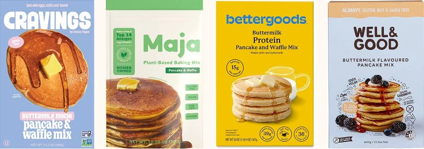
One exercise in our strategy process is the Sea of Same, where we study the visual language of a category to uncover opportunities for differentiation. As brands begin to look more alike, it becomes harder for shoppers to tell them apart. Because pandan is still unfamiliar to many Western shoppers, Wasi Brands keeps familiar category cues to support recognition while creating a bold visual identity rooted in its Vietnamese and Peruvian heritage.
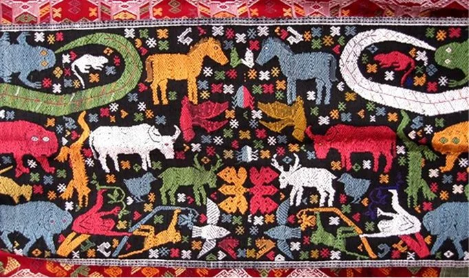

The Encyclopedia of Crafts in APR
Máximo Laura
Across both cultures, we found shared themes of geometric forms, nature-inspired details, vibrant color, and handcrafted ornamentation. These inspired a contemporary visual language that flexes across Vietnamese- and Peruvian-inspired products, as well as future products that blend both cultures.
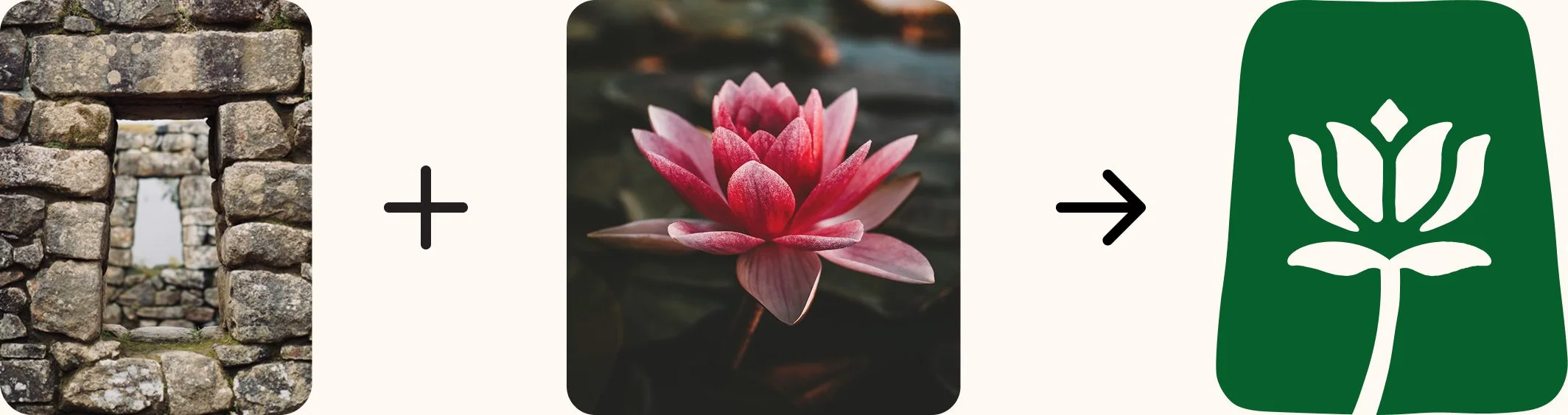
Inspired by the trapezoidal forms found in Incan architecture and the lotus, an important symbol in Vietnamese culture. Together, they create a doorway into the brand's story.
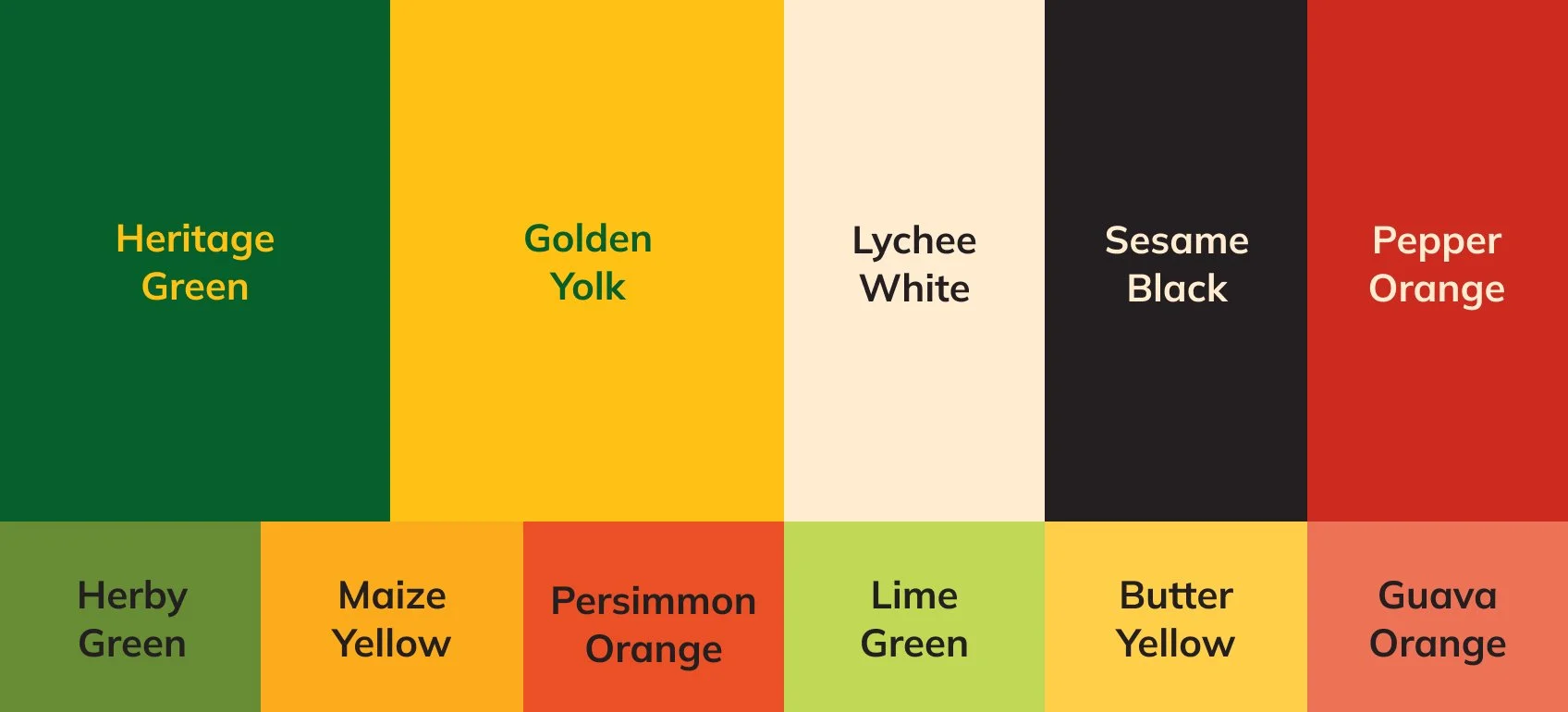
Green reflects the natural origins of pandan and the product that started it all, while yellow brings a sense of hospitality and optimism that helps the brand stand out on shelf. The palette captures the warmth and vibrancy of the culinary traditions behind Wasi Brands.
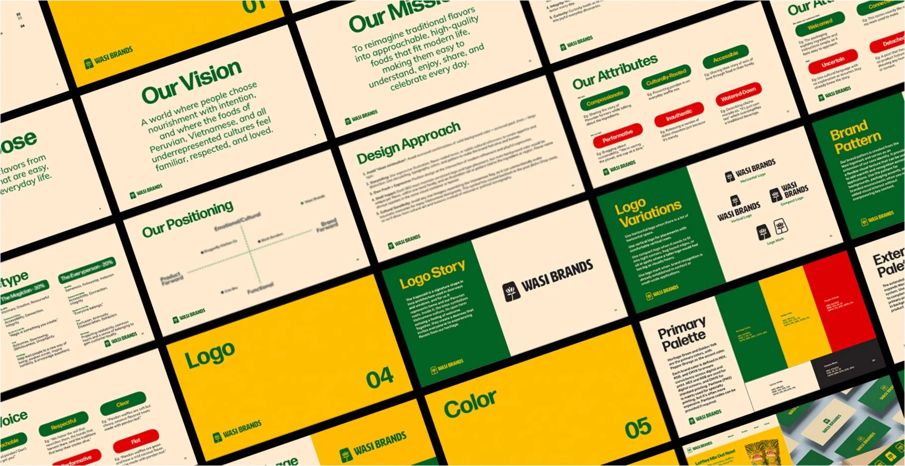
The identity system extends beyond the logo through a cohesive set of colors, typography, layouts, visual language, and design principles that define how the brand looks, feels, and communicates. These guidelines create consistency across every touchpoint while providing a flexible foundation that can evolve as Wasi introduces future heritage-inspired products.
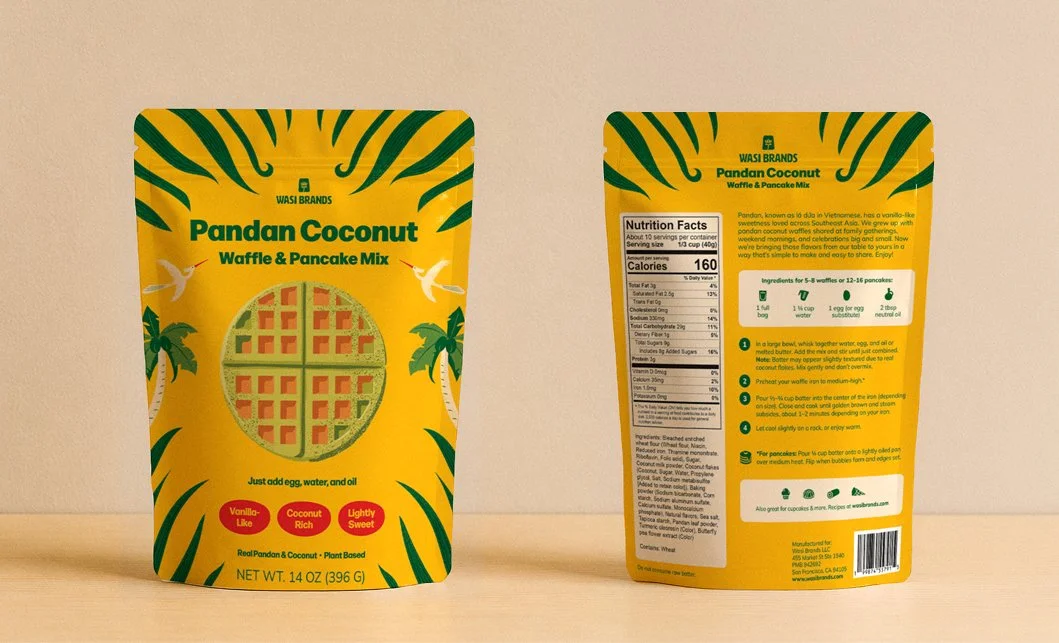
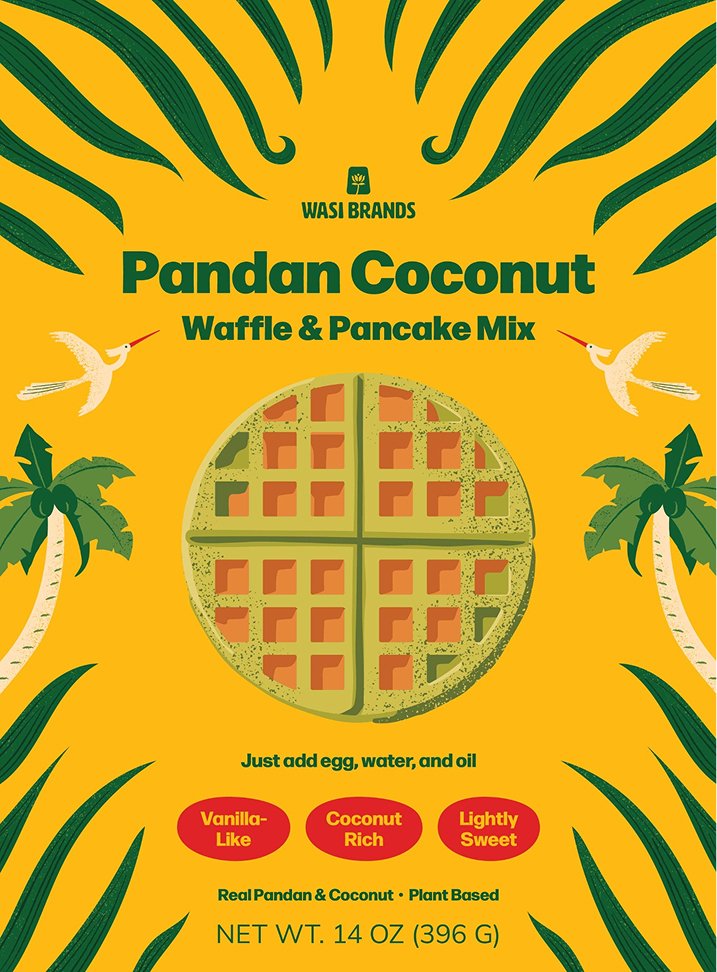
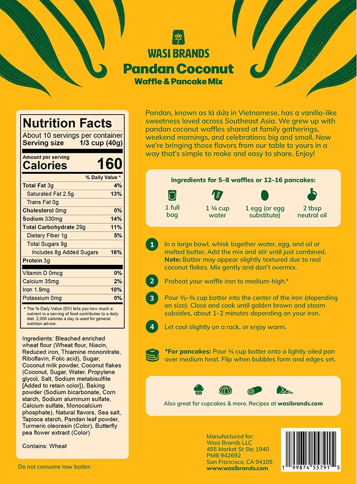
The final pouch packaging design brings the Wasi brand world to life through a bold retail experience designed for shelf impact. Meaningful cultural symbols, including the Vietnamese Lạc bird, alongside botanicals, ingredients, and organic forms create a rich visual world that celebrates Vietnamese and Peruvian culture in a contemporary, approachable way. The result is packaging that feels memorable, immersive, and distinctly Wasi.
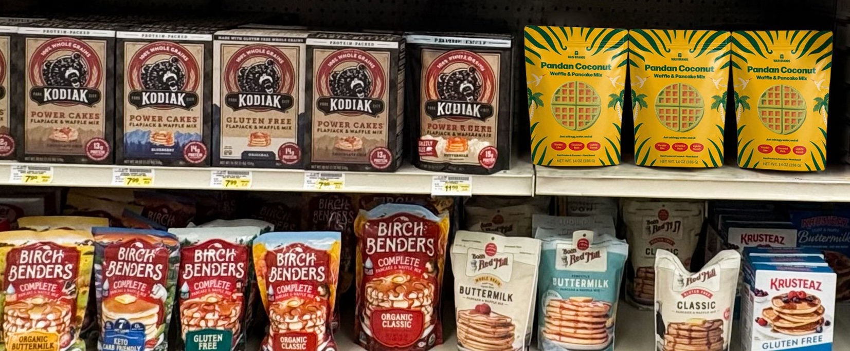
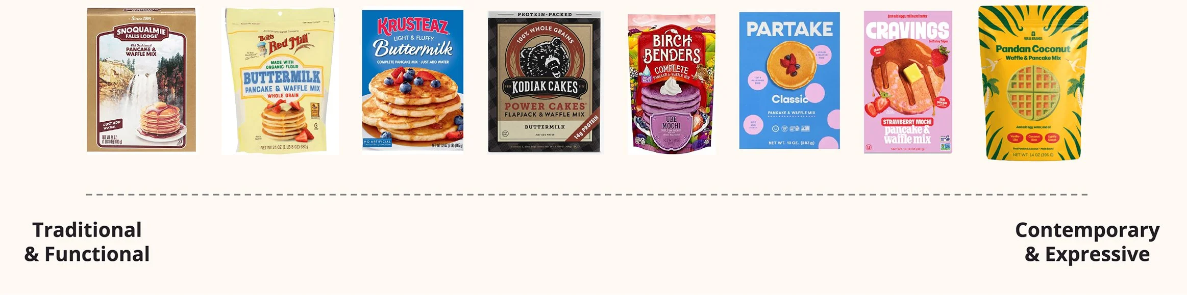
As the category shifts toward more expressive packaging design, Wasi Brands differentiates itself through a rich visual world inspired by Vietnamese and Peruvian heritage, brought to life through contemporary illustration and storytelling. By balancing familiarity with discovery, the identity makes the brand feel approachable to new audiences while creating a flexible system that can grow across future products lines without losing what makes it distinctly Wasi.
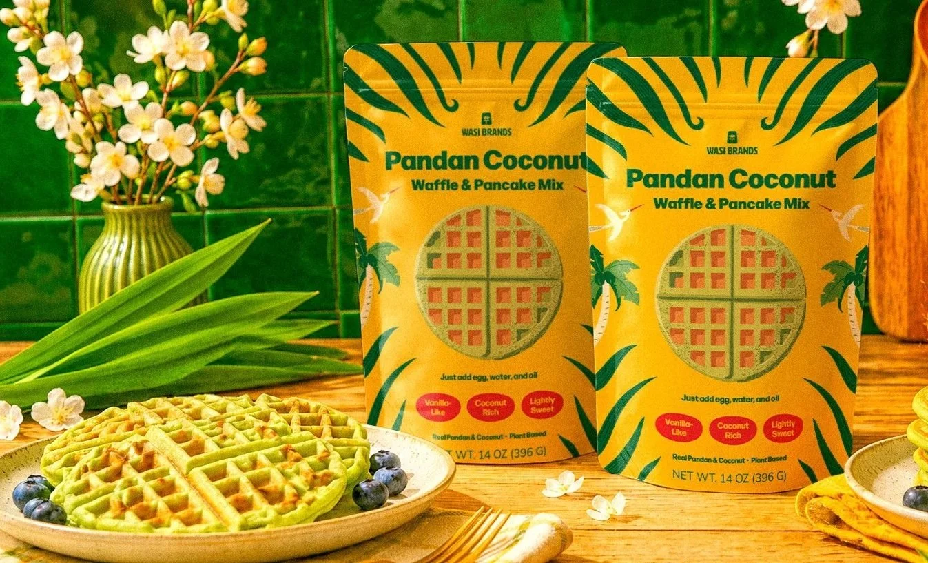
“Our packaging design has been the biggest success. Customers consistently rave about it, and it has become our strongest marketing asset. It's one of the main reasons people stop, notice, and remember our brand.”
Andrew Luu
Wasi Brands
Ready to spice up your brand?
Book a free 30-minute clarity call to get started.